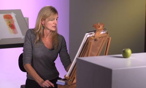
Take a look over the shoulder of an artist at work. Mary Jane Begin, an award-winning illustrator and Rhode Island School of Design professor, sits down at the drawing board and explains how complementary colors—colors on opposite sides of the color wheel—can make your art, illustrations, and designs more compelling and vibrant. Learn how to layer colors of different hues and translucencies, play with light and shadow, and subtract color to create a sense of form. Plus, learn to neutralize a color’s intensity simply by mixing it with its complement. Mary Jane illustrates these concepts through pastel on paper, but they can be applied to all types of media including digital endeavors.
Mary Jane uses the following materials in this course:
- Arches 140 lb hot press paper
- Tube watercolors- Winsor & Newton Cotman brand
- Paper stumps for blending
- Pastels- a variety of stick and pencil forms (including Conte pastel pencils)
- Short, fat, fine-bristle Winsor & Newton #2 and #4 brushes (for scrubbing color off)
- Sceptre Gold II sable/synthetic blend #3, #6, and #10 brushes
- Winsor & Newton Cotman brand 25 mm/1 in. flat brush (for washes)