From toggles to tabs, accessible components need to work across multiple devices and for a wide variety of users, including ones with disabilities. Good UX designs can help users navigate more comfortably and get more value out of apps and websites. In this course, expert Tetiana Gulei guides you through why accessibility matters and how you can design accessible components in Figma. Learn how to use the pre-created color and font styles, then create your first component. Explore creating accessible buttons, icons, radio buttons, checkboxes, and image cards. Then dive into making more advanced components accessible, like header menus and footers. Find out how to use Figma plugins for accessibility and practice what you’ve learned with a simple website that uses accessible components. Plus, get Tetiana’s practical advice on growing your knowledge of Figma components and applying what you’ve learned in this course to your own design projects.
Learn More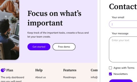